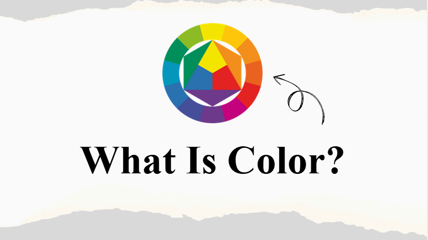
Color Wheels Without the Headache
Let’s be honest – most “color wheel guides” sound like they’re written by someone who’s never actually tried to match a throw pillow to a sofa. You’re hit with words like hue, saturation, and tetradic schemes and suddenly it feels like a lecture, not a solution.
I’m not here to do that to you.
Picture this instead: you’re standing in the paint aisle at Home Depot, holding seventeen nearly-identical shades of “greige,” and you’re about to cry. Or you’re staring at a closet full of clothes that somehow refuse to go together. Or maybe you’ve spent an hour trying to make your Instagram post look cohesive—and it still feels… off.
This guide is your escape hatch. No jargon. Just clarity.
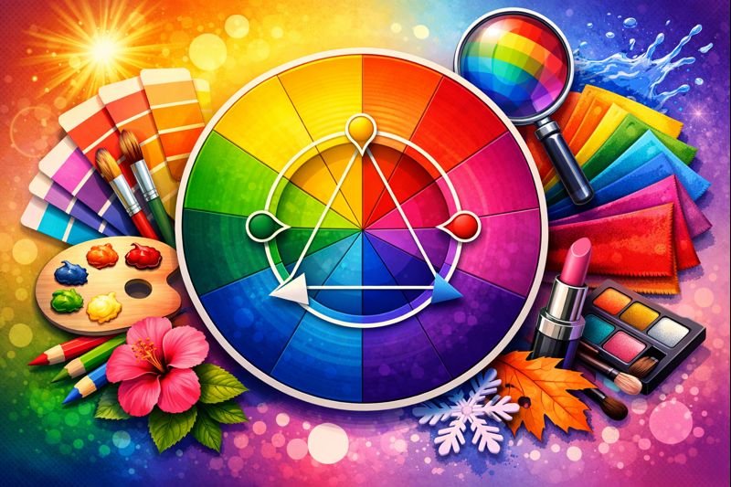
The Color Wheels You’ll Actually Use
Turns out, there’s more than one color wheel—and each one exists for a very real reason.
The classic RYB (Red, Yellow, Blue) wheel is the one you probably remember from art class. It’s the best choice when you’re working with physical color—paint, dyes, crafts, or DIY projects. If you’ve ever mixed colors and ended up with something muddy and disappointing, this wheel explains why.
Then there’s RGB (Red, Green, Blue), which is the language of light. Phones, TVs, and computer screens all use it. If you’re designing for websites, social media, or digital art, this wheel helps explain why colors can look amazing on screen but strange when printed.
Finally, CMYK (Cyan, Magenta, Yellow, Black) is what printers use. Business cards, flyers, posters—anything that’s physically printed behaves differently than digital color, and CMYK helps prevent dull or unexpected results.
Here’s the simple truth: you don’t need to memorize all of this. For everyday life—getting dressed, decorating your home, choosing colors you live with—the classic RYB wheel is more than enough.
Three Color Combos That Almost Never Fail
Forget complicated terminology. These three combinations handle about 95% of real-life color decisions.
First is the “spicy pair”, also known as complementary colors. These are colors that sit directly across from each other on the wheel—like blue and orange or purple and yellow. They feel bold, energetic, and attention-grabbing. This is perfect when you want contrast, not chaos. Think a navy sofa with a burnt orange pillow, or a simple design with one bright accent. The key is restraint—just a pop goes a long way.
Next is the “chill squad”, or analogous colors. These sit side-by-side on the wheel, like blue, teal, and green—or red, orange, and gold. The vibe here is calm, cohesive, and effortlessly put-together. This is the safest choice if you want things to “just work.” Wardrobes built this way feel intentional without trying, and rooms designed with these palettes are nearly impossible to mess up.
Then there’s the “one-color wonder”, also called monochromatic. This means using different shades, tones, and tints of the same color—light blue, dusty blue, deep navy. It feels minimalist, sophisticated, and intentional. It’s the fastest way to look polished, even if you’re totally winging it. An all-black outfit. A room layered in warm whites. Simple, clean, confident.
Where Color Theory Actually Shows Up in Real Life
This isn’t abstract theory—it’s practical, everyday help.
When you’re getting your hair done, the color wheel explains everything. Brassy orange tones are neutralized with blue-based toner because they’re opposites. Want sun-kissed highlights? Staying in the same warm family keeps things soft and natural instead of harsh.
When you’re decorating your home, it saves you from decision fatigue. If you love green, choosing a white paint with a subtle green undertone will instantly make your space feel cohesive instead of clashy—especially with plants and natural textures.
When you’re getting dressed, stop thinking in terms of “outfits” and start thinking in terms of palettes. Is today a chill squad day—soft, blended, calm—or a spicy pair day—bold, confident, high contrast? Your mood already knows the answer.
And when you’re designing anything digital, this becomes your secret weapon. A birthday card pops with a spicy pair for headlines. A resume feels calm and professional with a monochromatic gray palette. The difference is subtle—but powerful.
The Only Color Rules Worth Remembering
Warm colors—reds, oranges, yellows—feel energizing, inviting, and attention-grabbing.
Cool colors—blues, greens, purples—feel calming, receding, and serene.
Muted colors—those dusty, grayish tones—are subtle, sophisticated, and much easier to live with long-term.
That’s it. No overwhelm. No lectures. Just color choices that finally make sense.