Explore the Color with the Interactive Color Wheel
First I think the color wheel was just for school art class. You know, that circle teachers would point at and then move on from.
Turns out… it’s way more useful than I realized.
Color Wheel Picker
🔥 Most Taken Quizzes Worldwide 🌍
This interactive Color Wheel isn’t just for artists or designers. It’s honestly one of the easiest ways to understand how colors relate to each other — especially if you’re trying to build outfits, choose makeup shades, or create better visuals online.
Instead of guessing which shades “kind of” work together, you can actually see it.
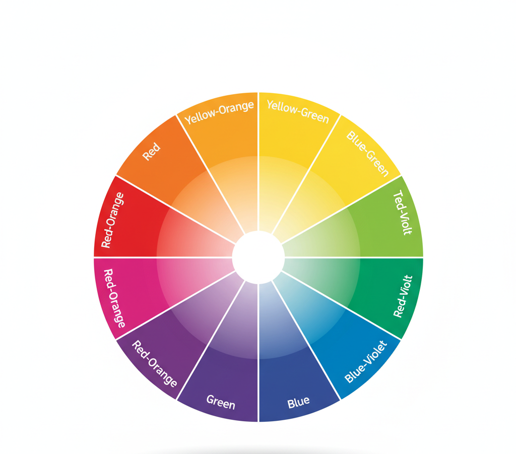
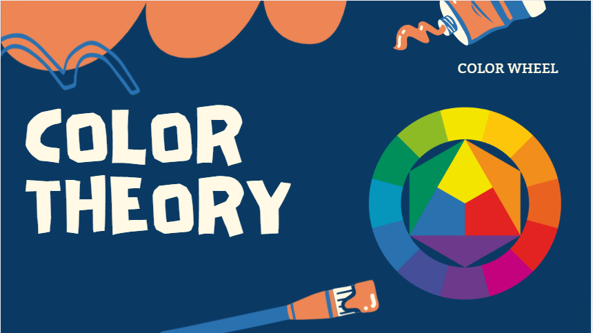
Primary colors. Secondary colors. Tertiary shades. Warm tones. Cool tones. It’s all there — but in a way that feels practical, not academic.
You can experiment. Click around. Mix things you wouldn’t normally try. And sometimes that’s when the best combinations happen.
How the Color Wheel Helps with Personal Color Analysis
If you’ve ever taken a personal color analysis (Spring, Summer, Autumn, Winter), you probably got a palette… and then wondered:
Okay. Now what?
That’s where the color wheel quietly becomes useful.
Once you know your season, the wheel helps you:
- Combine your best shades without clashing
- Pick accessories and makeup that don’t overpower your features
- Avoid colors that make you look tired
- Actually visualize what works together
It makes your personal color results feel real. Not theoretical.
Instead of memorizing rules, you just look at the relationships between colors.
And suddenly outfit planning gets easier.

What Is the Color Wheel Tool?
The Color Wheel Tool is basically your shortcut to color harmony.
You choose a starting color.
The tool shows you what works with it.
And you get exact color codes instantly.
HEX. RGB. CMYK. All of it.
So whether you’re:
- Planning a brand palette
- Updating your Instagram
- Even repainting a room
You’re not guessing anymore.
You’re choosing with intention.
How It Works
- Pick a base color
- Choose a harmony type
- Instantly see matching combinations.
- Copy the codes and use them anywhere.
No complicated setup. No design degree required.
The Three Color Combos I Actually Use
Let’s forget the technical language for a second. Here’s how I think about it.
1. The “Best Friend” Combo (Complementary)
These are colors across from each other on the wheel.
Blue + Orange.
Purple + Yellow.
This is my go-to when I want contrast. A navy outfit with burnt orange accessories? It just works.
It’s bold. But balanced.
2. The “Neighborhood” Combo (Analogous)
These colors sit next to each other.
Think teal, green, and blue.
This feels calm. Easy. Put together without trying too hard.
Great for bedrooms. Soft branding. Or those outfits that look effortless.
3. The “Party” Combo (Triadic)
Three evenly spaced colors.
Classic red, blue, yellow.
This one has energy. It’s playful. Great for creative projects or when you want something vibrant but not chaotic.

The One Thing Most People Don’t Realize
The color wheel is a guide. Not a strict rulebook.
It shows you why certain shades feel right together. But it doesn’t lock you in.
Sometimes I’ll mix pink and red (neighbors), then throw in green (which technically “shouldn’t” work).
And somehow… it does.
Because confidence matters just as much as theory.
The real magic of the color wheel isn’t memorizing categories.
It’s understanding relationships.
Once you see that, color stops being confusing.
It becomes creative.
And honestly? That’s when it gets fun.
